

READ ALSO: Getting Your Business on the Map: The Link Between Your Website and Google
Understanding the Core of Website Structure and Navigation
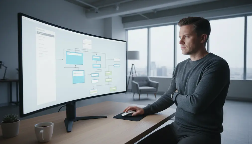
The Role of Information Architecture in Website Organisation
Information architecture (IA) is the backbone of any well-organised website. It’s the art and science of structuring and labelling content to help users find information and complete tasks. A solid IA strategy begins with understanding your audience and their needs, as well as your business goals. What are users looking for? What questions do they have? How do they typically interact with websites like yours? By answering these questions, we can begin to create a logical website hierarchy that reflects natural user expectations. Developing a clear site map is a critical step in IA. This visual representation of your site’s pages and their interconnections provides a birds-eye view of your entire digital landscape. It helps identify potential navigation roadblocks, ensures all important pages are accessible, and serves as a roadmap for both developers and content creators. Furthermore, a well-defined content organisation strategy involves grouping related pages together, using clear categories, and establishing a consistent nomenclature across your site. This makes it easier for users to scan menus and understand where they are and where they can go. For insights on making your content engaging, you might find our article on How to Write Website Text That Speaks to Your Australian Customers helpful.Designing Intuitive Pathways: Menu Design and Navigation Best Practices
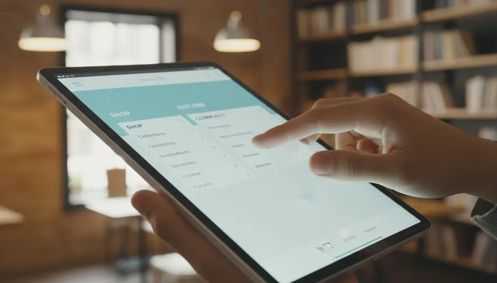
Crafting Effective Menu Design
Effective menu design goes beyond just listing pages. It involves thoughtful consideration of where the menu is placed (e.g., header, sidebar, footer), how it looks, and what labels are used. Key principles include: * Clarity and Simplicity: Use concise, descriptive labels. Avoid jargon. For example, "About Us" is clearer than "Our Narrative." * Consistency: The menu should appear in the same place and function the same way on every page. This builds familiarity and trust. * Hierarchy: Utilise dropdowns, sub-menus, or mega-menus to manage a large number of pages without overwhelming the user. However, be mindful of deep navigation structures that might make finding content tedious. * Visibility: Ensure your navigation is easily discoverable. Don't hide it behind obscure icons unless absolutely necessary for specific mobile contexts. * Responsiveness: Menus must adapt seamlessly to different screen sizes, from large desktop monitors to small mobile phones. A mobile-first approach is key here. Good menu design directly contributes to positive user experience (UX), making it easier for visitors to understand website layout and find what they need quickly.Implementing Navigation Best Practices for User Journeys
Beyond the primary menu, other navigation elements contribute to a seamless user journey. These include: * Breadcrumbs: These secondary navigation aids show users their current location within the website hierarchy and allow them to navigate back to parent pages easily. This improves findability and reduces frustration. * Internal Linking: Strategically linking related content within your paragraphs not only helps users discover more relevant information but also strengthens your SEO by distributing "link juice" across your site. * Search Functionality: For larger websites, a prominent and effective search bar is essential. It provides an alternative way for users to locate specific content when they know exactly what they're looking for. * Footer Navigation: Often overlooked, the footer is an excellent place for secondary links like privacy policies, terms of service, career pages, and even contact information. The goal is always to enhance intuitiveness, ensuring that every click brings the user closer to their goal without confusion or unnecessary effort. A good web navigation system makes the user feel in control and knowledgeable about where they are on your site. For more insights on guiding user actions, explore our article on Why Your Website Needs a Clear Call to Action to Get Results.Optimising Page Organisation for SEO and Users
Common Mistakes to Avoid in Website Organisation

The Impact of Thoughtful Organisation on User Flow and Conversions
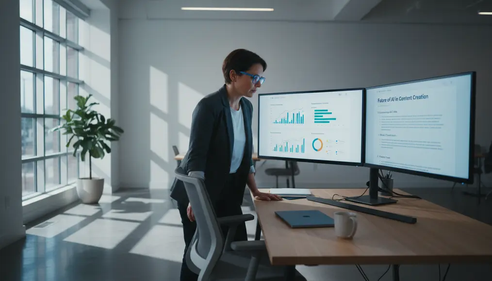
A meticulously planned website structure and navigation doesn't just make your site tidier; it fundamentally transforms the `user journey` and directly influences your business outcomes. When visitors can effortlessly `findability` information, they are more likely to stay longer, explore more pages, and ultimately convert. This directly addresses the `intent keywords` of businesses aiming to `improve user flow` and increase goal completions. Consider the journey of a potential client arriving on your Bornneo.Lab website. If they're looking for web development services, a clear "Services" menu item, followed by a logical "Web Development" sub-item, guides them instantly. From there, well-organised service pages with clear headings, internal links to case studies, and a prominent call-to-action make it easy for them to `understand website navigation` and progress. This seamless `user experience (UX)` significantly reduces bounce rates – the percentage of visitors who leave after viewing only one page – because users aren't hitting dead ends or getting lost. Furthermore, a well-defined `website layout` and page organisation enhance your site's credibility. A structured, easy-to-use site signals to visitors that you are organised, thoughtful, and value their time. This can boost trust, making them more comfortable engaging with your content and your services. In essence, by investing in `implement good site structure` and `design effective menus`, you're not just improving your website's functionality, but also its perceived professionalism and overall effectiveness as a business tool. For more on the importance of speed for user satisfaction, refer to our article on Speed Matters: Why a Fast Website Keeps Your Customers Happy. You can also explore how your site lives online with Understanding Website Hosting: Where Your Site Lives Online.Why choose Bornneo.Lab for Website structure and navigation?
- 🌟 Client-focused delivery with clear scope, timelines, and measurable outcomes aligned to your business goals.
- 🧩 End-to-end support from discovery and strategy to implementation, documentation, and handover.
- 📌 Practical solutions built to fit your existing stack and team workflow—no unnecessary complexity.
Conversion-Driven Design
We design digital experiences with a clear purpose. Every layout, interaction, and call-to-action is strategically crafted to guide users toward meaningful conversions—whether that means leads, sign-ups, or business inquiries.
Mobile-First & Responsive
With the majority of users accessing websites from mobile devices, we prioritize responsiveness from day one. Our solutions adapt seamlessly across screen sizes while maintaining performance and usability.
SEO & Performance Optimized
We build with technical SEO, site speed, and performance best practices in mind—helping your website earn visibility, trust, and sustainable organic growth.
Bornneo.Lab Client Testimonials
★★★★★ – Sarah L.: Bornneo.Lab helped us completely overhaul our website structure and navigation. The result is a much clearer path for our customers, and we've seen a noticeable improvement in our conversion rates. Truly an experienced team.
★★★★★ – Mark T.: The team at Bornneo.Lab provided invaluable guidance on our information architecture. They made a complex process seem straightforward and delivered a website that's a joy to use. Highly recommended for any business looking to `improve user flow`.
★★★★★ – Emily R.: We struggled with our previous site's `findability`. Bornneo.Lab's approach to page organisation was fantastic, making our content incredibly accessible and improving our overall user experience (UX).
★★★★★ – David K.: From `menu design` to `site structure`, Bornneo.Lab demonstrated a deep understanding of what makes a website effective. Our new web navigation system is intuitive and has received excellent feedback from our users.
★★★★★ – Jessica P.: The detailed planning around our website hierarchy by Bornneo.Lab ensured our new site made perfect sense from day one. They really helped us `design effective menus` that serve our visitors well.
READ ALSO: Simple Ways to Make Your Website Accessible for Everyone
Frequently Asked Questions About Website Organisation
What is website structure and navigation, and why is it important?
Website structure and navigation refers to the way your website's pages are organised and linked together, and how users move between them. It's crucial because it directly impacts user experience (UX), making your content easy to find and understand, which in turn improves SEO, reduces bounce rates, and boosts conversions. It helps users `understand website navigation` and find what they need.What is information architecture (IA) in the context of web design?
Information architecture is the practice of organising, structuring, and labelling content in an effective and sustainable way. It ensures the `intuitiveness` and findability of information on your site, forming the logical foundation for your `site structure` and content organisation, which is vital for users to `learn website organization`.How does good website structure benefit SEO?
A well-defined website structure and navigation helps search engine crawlers understand the hierarchy and relationships between your pages. This makes it easier for search engines to index your content, understand its relevance, and assign authority, ultimately improving your site's visibility in search results for both `short tail keywords` and `long tail keywords`.What are some key components of effective menu design?
Effective menu design should be clear, concise, consistent, and visible. It should use descriptive labels, employ a logical website hierarchy (with sub-menus if necessary), and be fully responsive across all devices. The goal is to make web navigation as straightforward as possible for the `user journey`.How can I ensure my website pages make sense to visitors?
To ensure your pages make sense, focus on user-centric design. Start with a solid information architecture, implement clear content organisation, use intuitive menu design and `navigation best practices`, and continuously gather feedback. Test your `website layout` with real users to gauge intuitiveness and `findability`, helping you to `improve user flow` and `design effective menus`.Contact Us
Ready to move forward with clarity and confidence? Get direct insights and tailored recommendations by speaking with our team.
