

In today's digital landscape, your website isn't just a static brochure; it's a dynamic sales tool, a communication hub, and often the first point of contact for potential clients. But how effectively is it converting curious visitors into valuable leads? Often, the critical juncture for this transformation lies within your website forms, particularly your contact forms. A poorly designed form can be a significant barrier, pushing interested parties away rather than inviting them to engage.
Many businesses overlook the strategic importance of an optimized website contact form design, viewing it as a mere technical necessity rather than a powerful conversion tool. They focus on driving traffic but then falter at the crucial moment when a visitor decides to take action. The goal isn't just to have a form; it's to have a form that actively encourages interaction and makes it effortless for visitors to become inquiries.
This article will delve into the nuances of effective form creation and form optimization strategies, providing you with the insights needed to transform your website forms into robust lead-generating assets. We'll explore how to craft forms that not only look good but also perform exceptionally, helping you to truly get more inquiries from website visitors and ultimately, increase website leads for your business.
READ ALSO: How to Use Social Media to Drive More Visitors to Your Website
The Critical Role of Website Forms in Lead Generation

At its core, a website serves multiple purposes, but for most businesses, one stands out: connecting with potential customers. This connection often happens through website forms. They are the digital handshake, the bridge between a casual visitor and a potential client. Without effective lead generation forms, all the effort put into attracting visitors to your site might be in vain. These forms are not merely data entry points; they are essential for capturing crucial information, understanding visitor intent, and initiating the sales process. The success of your online presence heavily relies on your ability to convert passive browsing into active online inquiries.
Consider the journey of a website visitor. They land on your page, perhaps after a search or a social media click. They browse, they learn, and then, if interested, they look for a way to connect. This is where your contact forms come into play. If the form is confusing, too long, or visually unappealing, that potential lead might simply leave, abandoning their intent to connect. This highlights why a well-thought-out form design is paramount. It directly impacts your ability to generate more leads website-wide. To truly turn visitors into inquiries, businesses must prioritize the user experience of their forms. This involves understanding what makes a user want to complete a form versus closing the tab. Understanding What is 'User Experience' and Why Should Your Business Care? is fundamental to building successful online interactions.
Understanding User Psychology for Effective Form Design

Designing effective website forms goes beyond aesthetics; it delves into the psychology of your users. The goal is to create user experience forms that feel effortless, secure, and encouraging. People are naturally wary of giving out their information, and every extra field or confusing instruction can add friction, leading to a higher reducing form abandonment rate. To truly get more inquiries from website visitors, you need to anticipate their concerns and streamline their interaction.
Simplicity and Clarity in Your Form Layout
One of the most common mistakes in form design is overcomplication. Users appreciate brevity and clarity. When designing your website contact form design, always ask: "Is this field absolutely necessary right now?" Often, businesses collect too much information upfront, scaring away potential leads. Aim for a minimalist approach. Use clear, concise labels for each field and avoid jargon. If a field requires specific formatting (e.g., phone number), provide an example. A straightforward, easy-to-understand layout can significantly improve form submissions and prevent users from feeling overwhelmed. By keeping your forms simple, you reduce the cognitive load on visitors, making the process smoother and more inviting.
Strategic Placement and Visibility
Even the most perfectly designed form is useless if visitors can't find it. The placement of your website forms is critical for encouraging online inquiries. Your primary contact forms should be easily accessible from every page, typically linked in the navigation menu or footer. For specific services or products, consider embedding relevant lead forms directly within the content where users are most likely to be interested. For example, a "Request a Quote" form for a service should be on that service's dedicated page. High visibility, clear calls-to-action (CTAs) like "Get a Free Consultation" or "Request Information," and intuitive navigation all contribute to making it easier for visitors to get more inquiries from website visitors. The fewer clicks or scrolls required to find and interact with a form, the better.
Key Elements of an Optimized Website Contact Form Design
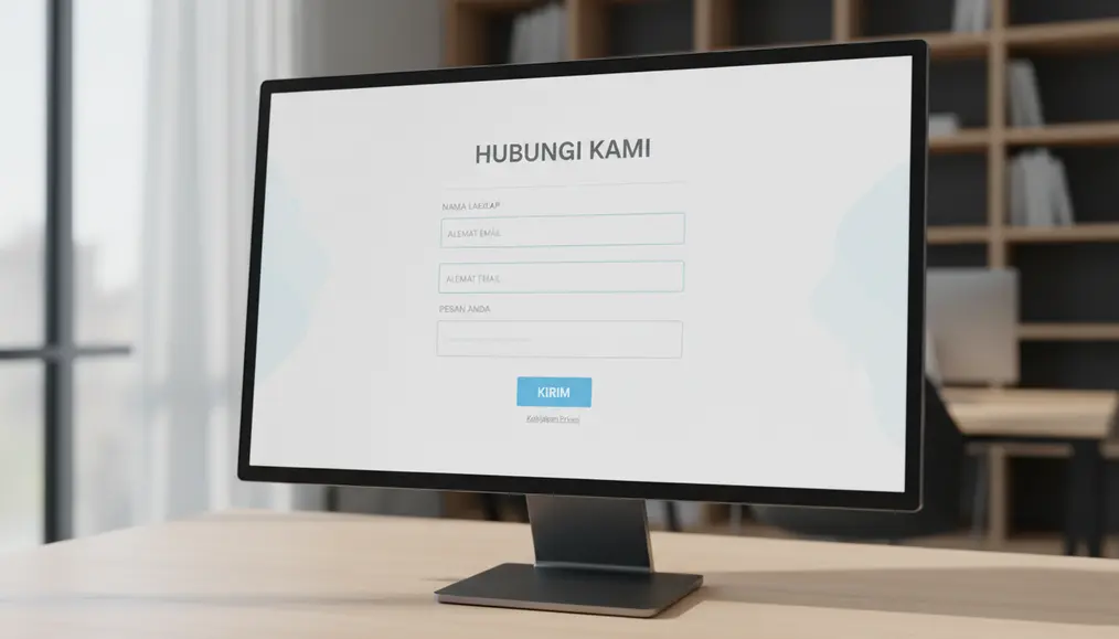
An effective website contact form design is a blend of aesthetics, functionality, and psychological understanding. Adhering to certain form best practices ensures that your forms are not just present but actively working to improve contact form conversion rates. When aiming to optimizing website forms for conversions, several key elements must be meticulously crafted.
Compelling Call-to-Action (CTA)
The button that submits your form is arguably its most important element. Generic terms like "Submit" or "Send" are bland and offer no value proposition. Instead, use a compelling Call-to-Action (CTA) that clearly communicates what the user will gain by completing the form. Examples include "Get Your Free Quote," "Download Our Guide," "Schedule a Consultation," or "Connect with Our Experts." A strong CTA motivates users, manages their expectations, and makes the action feel valuable rather than a chore. This simple change can dramatically improve form submissions and help you get more inquiries from website visitors.
Minimalist Field Requirements
Every field you add to your website forms increases friction and the likelihood of a higher reducing form abandonment rate. When you're trying to increase website leads, the golden rule is to ask for only the absolutely essential information at the initial point of contact. For a general inquiry, often just a name, email, and message field suffice. If you need more detailed information, consider using multi-step forms or gathering additional details in a follow-up conversation. This minimalist approach streamlines the user journey, making the process quick and painless, thereby significantly optimizing website forms for conversions.
Trust Signals and Reassurance
Users are increasingly cautious about sharing their personal data online. To foster trust and encourage online inquiries, incorporate trust signals directly on or near your website forms. This could include a clear, concise privacy policy link, a statement about data security (e.g., "Your information is 100% secure and will not be shared"), or even short testimonials from satisfied clients. For service-based businesses, showcasing Why Professional Photos of Your Team Build More Online Trust can also translate to higher form completions, as it adds a human element and reinforces credibility. These elements reassure visitors that their information is safe and that they are dealing with a reputable entity, making them more likely to proceed with form submissions.
Advanced Strategies for Boosting Website Inquiries

Once you've mastered the fundamentals, it's time to explore more advanced form optimization strategies to further amplify your ability to generate more leads website-wide. These techniques leverage technology and a deeper understanding of user behavior to refine your website forms and significantly increase website leads.
Implementing Interactive and Multi-step Forms
For longer forms where you genuinely require more information, splitting them into logical, smaller sections can dramatically reduce perceived effort and combat the reducing form abandonment rate. These are known as multi-step forms. Each step feels less daunting than one long scroll, and a progress bar can motivate users to complete the entire process. Furthermore, incorporating interactive forms—such as those with conditional logic (showing or hiding fields based on previous answers)—can personalize the experience and only ask relevant questions, making the form feel more conversational and less like an interrogation. This advanced approach is a powerful way to improve form submissions for complex inquiries.
Leveraging Form Validation and Error Handling
Nothing is more frustrating for a user than filling out a form, clicking submit, and then being told there's an error without clear guidance. Robust form validation is crucial for positive user experience forms. This means checking user input in real-time or immediately upon submission and providing clear, specific, and user-friendly error messages. For example, instead of just "Error," say "Please enter a valid email address." Highlight the problematic fields visually. Good error handling prevents frustration, helps users correct their mistakes quickly, and ultimately leads to more successful form submissions. It's a fundamental aspect of form best practices that directly impacts your conversion rates.
A/B Testing and Form Analytics
The journey to perfect website contact form design is ongoing. What works for one audience or industry might not work for another. This is where A/B testing and form analytics become invaluable. A/B testing involves creating two versions of your form (e.g., different CTA text, field order, or number of fields) and showing them to different segments of your audience to see which performs better. Form analytics tools track how users interact with your forms – where they pause, which fields they skip, and where they abandon the process. This data provides actionable insights, allowing you to continually refine your form design and implement targeted form optimization strategies to improve form submissions and get more inquiries from website visitors. Regular analysis is key to consistently optimizing website forms for conversions.
Why choose Bornneo.Lab for Website contact form design?
- 🌟 Client-focused delivery with clear scope, timelines, and measurable outcomes aligned to your business goals.
- 🧩 End-to-end support from discovery and strategy to implementation, documentation, and handover.
- 📌 Practical solutions built to fit your existing stack and team workflow—no unnecessary complexity.
Conversion-Driven Design
We design digital experiences with a clear purpose. Every layout, interaction, and call-to-action is strategically crafted to guide users toward meaningful conversions—whether that means leads, sign-ups, or business inquiries.
Mobile-First & Responsive
With the majority of users accessing websites from mobile devices, we prioritize responsiveness from day one. Our solutions adapt seamlessly across screen sizes while maintaining performance and usability.
SEO & Performance Optimized
We build with technical SEO, site speed, and performance best practices in mind—helping your website earn visibility, trust, and sustainable organic growth.
Bornneo.Lab Client Testimonials
★★★★★ – Sarah L.: "Bornneo.Lab completely transformed our inquiry process. The new website contact form design is sleek, user-friendly, and has significantly increased our daily leads. We're thrilled with the results!"
★★★★★ – Michael K.: "The team at Bornneo.Lab understood our needs perfectly. Their expertise in form optimization strategies helped us reduce abandonment rates and get more inquiries from website visitors than ever before. Highly recommended."
★★★★★ – Emily R.: "We engaged Bornneo.Lab to overhaul our lead generation forms, and the impact was immediate. The insights from their form analytics led to smart changes that truly delivered on our goal to increase website leads."
★★★★★ – David P.: "Bornneo.Lab's approach to user experience forms is top-notch. They made our complex forms simple and intuitive, which in turn helped us improve contact form conversion rates considerably."
★★★★★ – Jessica T.: "From initial consultation to final implementation, Bornneo.Lab provided outstanding support. Their advice on form best practices was invaluable in helping us optimize website forms for our business."
Common Pitfalls to Avoid in Website Form Design
While focusing on best practices is essential, being aware of common mistakes can be equally important for improving your website forms. Avoiding these pitfalls can prevent a significant reducing form abandonment rate and help you more effectively get more inquiries from website visitors.
- Too Many Fields: This is perhaps the most frequent error. Each additional field increases the perceived effort and discourages completion, especially for initial online inquiries. Keep it minimal.
- Unclear Instructions or Labels: Ambiguous field labels or a lack of guidance can confuse users. Ensure every field's purpose is immediately obvious.
- Lack of Mobile Responsiveness: A form that's difficult to navigate or fill out on a smartphone is a major turn-off. With most users accessing sites on mobile, your website contact form design must be perfectly responsive. This is crucial for Why Your Website Needs to Load Fast on Australian Mobile Networks and user experience.
- Poor Error Handling: As discussed, generic error messages or failing to highlight specific errors creates frustration and often leads to users giving up on form submissions.
- Missing Trust Signals: Without clear privacy statements or security assurances, users will be hesitant to share personal data, negatively impacting your ability to increase website leads.
- No Confirmation Message: After a user submits a form, they need immediate confirmation that their submission was successful. A simple "Thank You!" message or redirection to a confirmation page provides reassurance and closes the loop on the user experience forms.
- Not Tracking Form Analytics: Failing to monitor how users interact with your forms means you're missing out on vital data to implement effective form optimization strategies. Without form analytics, you're designing in the dark.
Measuring Success: How to Increase Website Leads
To truly understand the impact of your efforts in optimizing website forms for conversions, you need to track key metrics. Measuring success isn't just about counting raw submissions; it's about understanding the quality of those submissions and the overall efficiency of your lead generation forms. By focusing on the right data, you can continuously refine your form design and generate more leads website-wide.
The primary metric to track is your form's conversion rate – the percentage of visitors who start filling out a form and then complete it. A high conversion rate indicates an effective website contact form design. Conversely, a high abandonment rate (the percentage of users who start but don't finish) signals areas that need improvement. Tools for form analytics can pinpoint exactly where users drop off, allowing you to make targeted adjustments. For example, if many users abandon the form at the "phone number" field, perhaps making it optional or moving it to a later stage could improve form submissions.
Beyond conversion rates, consider the quality of the leads generated. Are the online inquiries relevant to your business? Are they converting into actual sales? This qualitative feedback, combined with quantitative data, provides a holistic view. Regular review of these metrics is a fundamental aspect of form best practices. Remember that even the finest form design needs a compelling reason for visitors to engage. Just as carefully crafted The Secret to Writing Headlines That Keep People on Your Website draws attention, an optimized form seamlessly guides them to action, making it easier to improve contact form conversion and achieve your business objectives.
READ ALSO: How to Use Video on Your Website Without Slowing It Down
Frequently Asked Questions About Website Forms
What is the ideal length for a website form?
The ideal length for a website form is as short as possible. For initial online inquiries, aim for 3-5 fields (Name, Email, Message). If you need more data, consider multi-step forms to break it down. The goal is to reduce the reducing form abandonment rate by making it seem less daunting.
How can I make my contact forms more secure?
To make your contact forms more secure, always use HTTPS for your website. Implement CAPTCHA or reCAPTCHA to prevent spam. Ensure your server-side validation is robust, and never store sensitive user data longer than necessary. Clearly communicate your privacy policy to build trust.
What are conversion rate forms?
Conversion rate forms refer to the percentage of website visitors who complete a form out of the total number who viewed or started filling it out. A high conversion rate indicates an effective website contact form design and successful form optimization strategies for lead generation forms.
How often should I review my form design?
You should review your form design regularly, ideally quarterly or whenever you make significant changes to your website or business offerings. Continuously monitor your form analytics to identify friction points and areas for improvement, allowing you to continually optimize website forms.
Can AI help with form optimization strategies?
Yes, AI can significantly assist with form optimization strategies. AI-powered tools can analyze user behavior patterns from form analytics, predict optimal field orders, suggest personalized form experiences, and even automate A/B testing. This can lead to more intelligent and effective user experience forms, helping you to generate more leads website-wide. For more insights, you can explore The Role of AI in Modern Websites: How it Can Help Your Business.
Contact Us
Ready to move forward with clarity and confidence? Get direct insights and tailored recommendations by speaking with our team.
Disclaimer: This article is intended for informational purposes only and does not constitute professional advice. The information provided is based on general web development principles and best practices. For specific recommendations tailored to your business needs, please consult with a qualified web development expert.